Build Up or Build Hausmannian?
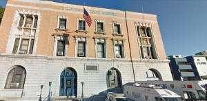
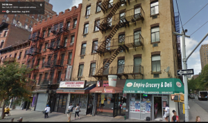
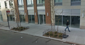
Hausmannian means the typical six-story building one sees in Paris, one of the most dense but liveable cities. Baron Von Hausmann was responsible for much of the six-story buildings lining the avenues in Paris. The photo on the right however, is from a Tribeca version of a Hausmannian building. Hausmannian density is not only found in Paris, it is found in our historic districts all over New York.Anyone who has walked the streets of Manhattan or prime Brooklyn looking at all the new construction would come to the same conclusion: New York is slowly morphing into a history-free, high-rise city without visual distinctiveness. Bit by bit, our pre-war (WW 2) load-bearing masonry buildings of 4-10 stories are being buried in an ocean of globalized concrete, glass and steel curtain wall towers. In some corners we could be anywhere in the world.
Will the Mayor’s new affordable housing plan make the problem worse? The answer to that depends on how the deal with the Real Estate Board of New York plays out. All signs point to the mayor agreeing to zoning changes to allow massive bulk and height in exchange for inclusionary zoning. On the bright side, the Mayor is committing only 8 billion dollars of the city’s tax revenue to this cause, which sounds like a lot, but technically is a budget that can only build about 2,300 units of affordable housing, unless by some unspecified miracle it is meant as leverage money.
Let’s be Design Critics for a Moment
Below, you can see some pictures of what affordable housing looks like. I took all the examples from a previously cited report to the City’s housing administration. Good urban design questions to ask are:
Do the buildings contribute to the beauty of a neighborhood?
How does the building connect to public transport?
Is street level commerce accommodated?
Is the building about an architect’s vision or is it about a lively streetscape?
Are there trees on the street? Is there any sunshine on the street?
Would anyone want to raise a family there?
Is the density Hausmannian – not excessive, but not too low?
In short, are we in the historic districts of the future?
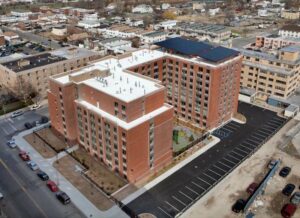
The Eltona
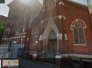
First up, the Eltona in the Bronx. This is a five-story building, with 63 units, all built at the bargain price of $262,000 per unit. This is in Melrose, a real neighborhood with lots of empty lots, but plenty of historic structures around. Check out the three photos below. Two are of the general context. The first shows a stunning old masonry building opposite the Eltona and the second shows charming church down the street from the Eltona. The third photo is the Eltona itself.
The Eltona does an admirable job of fitting in. It is a mid-block development, so it is hard to penalize it for the absence of street-level commerce. The window guards are cutesy, but this is beautiful (okay, let’s use Huxtable’s word “handsome” instead) affordable housing, done at a great price. We might quibble with the paleness of the brick, the step-down element on the ground floor, and the odd striping effect along the lines of the window lintels. But the striping might have been borrowed from the beautiful building across the street. The roofline looks a bit too much like a cornice was stripped away from it. But it is excellent Hausmannian-style density, adapted to the neighborhood with correct massing and very good contextual design. Grade: B for architecture, B+ for urbanism. Great job, Danois architects!
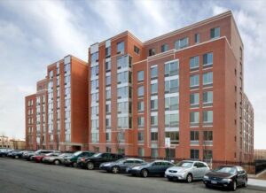
Highbridge Terrace
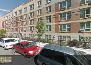
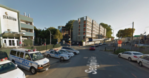
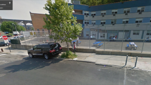
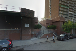
Next, see some photos of Highbridge Terrace in the Bronx. Dunn Development Corporation built this 65-unit building at a cost of $282,000 per unit with the architectural firm SLCE. This site is a scrappy, seemingly useless piece of land adjoining the grim Major Deegan Expressway. The site has a middle-of-nowhere feel to it, although it is near a charming old masonry police station. It is close to Highbridge Park, and not far from a typical brick garden city style housing project. Alas, it is a very long walk to the nearest subway, the #4 train at 167th street.
Look at some of the “existing conditions” photos below. There isn’t much of a neighborhood around, except some very good trees. There is a strange Howard Johnson’s a block from the police station, fronting the Major Deegan Expressway. The challenge here is to create something that brings a sense of urbanity to this lost corner of the Bronx, to make it a place you’d want to raise your kids. Here is a photo of the site under construction, a small photo of the neighboring building, and a photo of the aforementioned charming police station. The building in far left distance of the first photo is Highbridge Terrace and distant middle of the photo looks to be phase 2 of the project. The middle photo shows the “neighborhood” directly opposite Highbridge Terrace. Then you can see a photo of the policy building. The last photo is the completed phase 1 building.
Highbridge Terrace wins quite a few points here. It is not an ugly building. The density and massing is correct for the area. Yes, the top floor is oddly glassy and doesn’t fit with the rest of the building and was a mistake. They should have left the ground floor for street-level commerce, the selected treatment looks too much like a hostile moat. But despite these errors, one could imagine the area filling up with buildings like this and a real neighborhood emerging with sidewalks and trees. The color patterning is peculiar, not great, but it doesn’t make you shudder. Grade: B for architecture, B for urbanism (dinged for the street level problems).
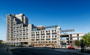
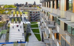
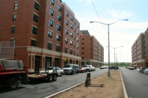
Via Verde
Now turn to Via Verde, a whopping 222-unit development built at the eyebrow-raising cost of $441,000 per unit in the Melrose area of the Bronx. Jonathan Rose is the developer. Dattner and Grimshaw are the architects. Via Verde got a lot of media hype because it has an energy efficient design. It includes some ground floor retail, green energy, a community facility somewhere in the building and a roof garden. Many of the units were sold as co-ops. The neighborhood has a mix of old masonry buildings, single family townhomes, decent looking tenements, and unpleasant Corbusian housing projects sitting on “pilotis”. There is an attractive school nearby. This is a compelling true New York neighborhood that just has too many empty lots. I suspect there were once many more masonry buildings. Because it is close to public transport, there are other new developments close to Via Verde, just along St. Ann’s Avenue. These new developments, of which Via Verde is one, get a lot of credit for bringing a Hausmannian density to the area and providing for street-level commerce, but the bad architecture brings down the whole affair of Via Verde. Despite the roof garden, it is a confusing mess of balconies, ramps, stairs, levels, jarring triangles and metal objects pointing this way and that.
The challenge here was to design something contextual given the existing mix of housing in the area. A better architect would have been inspired by the older pre-war masonry structures, but modernist architects hate all that (“it’s the past”, they complain). In fact, all the newer development in this area seems to have ignored the existing history of the area (see the first photo). Via Verde does too, but it makes it worse by jamming up a 20-story tower along side the lower rise units. It gives the block a strange lopsided look and shadows the neighbors. While I am sure the units are lovely inside, on the outside, Via Verde does not float. Grade: C on urbanism and D on the architecture.
The first photo shows the neglected context of Via Verde.

Elliot-Chelsea Building
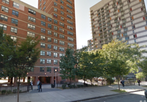
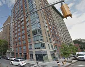
Fourth is the Elliot-Chelsea building in Manhattan, with 168 units. It is an excessively tall tower with a lollipop on top, with an average cost per unit of $386,000. This tower building barely qualifies barely as affordable housing, as it rents to people earning between $100-200,000 a year. The context is problematic. It is a part of Chelsea that has been deeply damaged by urban renewal and ugly public housing projects that are massive and over-scaled. The remnant bits of pre-urban renewal Chelsea here are charming. See the photo below. The building also has the challenge of trying to fit in exactly alongside a very nice pre-war palazzo building. The last picture shows the building itself.
The architect ought to have taken his cues from the pre-war palazzo next door. Because he did not, it looks like something out of suburbanized Battery Park City, but not as successful on the ground floor as its look-alikes on North End Avenue. The street level fails to match up to the neighboring palazzo, and by ignoring the older and better buildings across the street, mocks them. Looking at the strange window shapes on the ground floor, it is hard to imagine what commerce will want to rent there. It seems to have borrowed its totally minimal sense of context more from the failed public housing next door rather than to the stronger – and older – buildings next door and across the street. Bad choice on the part of the architects. It is also just too tall, ignores the cornice on the existing palazzo and has an ugly setback high up that doesn’t even match the rest of the building. Sixty-three units on one small lot also adds too much density where it is not needed. Grade: C- for architecture, D for urbanism with a special ding for taking down unnecessarily a big London plane tree.
Dumont Green
Fifth is the Dumont Green in East New York by Hudson, Inc. This is a massive, but attractive 176-unit building, with the absurdity of a parking lot behind it. Hudson Inc is an experienced affordable housing developer and not new to East New York. Not everything they build is great, but once in a while they really get it right as we will see later. Average cost per unit here was $290,000.
East New York is a mix of abandoned lots, very low-rise two-story family homes in bad condition, and the worst of public housing messes such as the Linden houses (see first photo). It also has the worst of surbuban world in a misguided effort to bring a giant shopping mall to the area. It went up during the Bloomberg era. East New York is one place where there is a chance to build the city fresh, and show what the historic districts of the future could be. It does need a Hausmanian density, which Hudson Inc is indeed providing in this particular site, but it needs to be done without ceding to the car. But Hudson Inc, can’t be blamed for that, the city made them add the ridiculous parking lot. To Hudson Inc’s credit, they even wrote an essay in CityLand magazine ridiculing City Planning for forcing a parking lot on them.
The brick is attractive. There is a well-proportioned building with a useful back courtyard and even a playground. Yes the fenestration is off a bit, putting it on the knife-edge of post-modernist messiness, but it pulls back just enough. The form of this building will be familiar to any afficionado of old New York. The fencing around the building seems awkward, a relic from a different kind of building, but that kind of fencing is found in other parts of the neighborhood. You could consider it to be a contextual element. Yet that grassy space between the fence and building risks becoming a weird no-man’s land rather than real garden space. The building is a bit too big on top, but executed with the sensibility of someone who appreciates the usefulness of symmetry and harmony. Score: A- on architecture, B+ on urbanism (can’t help docking it for the parking in the back).
Harlem RBI Houses
Sixth on the list is the Harlem RBI Houses in Harlem with 89 units averaging $311,000 per unit. Jonathan Rose was the developer. This is an odd duck. Housing units and a school were built on what appears to have been grassy space amidst a public housing project. This building could be anywhere in the world and while it is good to have a school, the whole glassy enterprise has no NY in its DNA. Are we in East Berlin? The only hint it is NYC is the glimpse of the projects behind it. Grade: D for architecture, D for urbanism. But thank you for the school.
Arbor House
Seventh is the Arbor House in the Morrisania section of the Bronx, with 124 units averaging $304,000 per unit. This part of the Bronx was wrecked by urban renewal and public housing. The older bits have distinctive character (see second photo below). Arbor House is the third photo.
Alas, the architects went all out post-modern. Bravo for the rooftop greenhouse and hydroponic farm, but the rest of the design is appalling. The silly window covers and the pop-out windows all create a desire for post-modernism to just go away. It is hard to look at this building for very long as it is too busy with uninteresting detail. Buildings need to be calm, but interesting. The density is also too much- six stories would have been adequate. It was nice that they respected the street line and allowed for the possibility of street-level commerce. Score: D on architecture, B+ on urbanism.
Gateway Elton
Last, we have the Gateway-Elton development in East New York, again by Hudson Inc. This project really delivers on six-story Hausmanian density with style. It creates a new urban street with an interesting sense of closure, but openness to the emerging cityscape of East New York. It is what Battery Park should have been. The solar panels are less than charming, but solar is solar so brownie points for getting Con-Ed off the backs of the lucky residents. The brick is attractive, the right color, there are lintels, and the respect for old New York gives a general sense of harmony and regularity in the window patterns. There is the hint of a cornice (it would have been better with a more substantial one) and excellent urbanized street level commerce all at the right height with appropriately scaled windows. Thankfully the commerce does not look like Duane Reade can easily come in and mess things up. There will be sun on the street and trees eventually. The planted meridian on the street is a pleasant touch – we’ve seen similar success on Broadway in the Upper West Side.
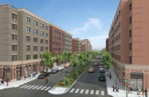
This is as close to Shangri-la as we going to get with affordable housing. Gateway-Elton (not the silly shopping mall nearby) represents the historic district of the future. It shows how to do beautiful, urban affordable housing. Score: A for architecture, A + for urbanism. Inspiring work, Hudson Inc.!
Conclusion
Attention Mayor DiBlasio. Do what works. Here there are two inspiring examples: the Gateway-Elton and the Eltona. Neither requires you to give away our sky and sunshine to REBNY’s urge to build up and house oligarchs in the heavens. Both show you how to make the historic districts of the future as medium-density, Hausmannian neighborhoods. These are places that families will actually want to live in instead of just enduring and escaping at the first opportunity. They are places that carry on the great urbanist traditions in our built environment that are found in New York’s historic districts.
Purchase “Tribeca and Its Architecture”