In this issue:
-Film Screening of “The Human-Scale”
-There Goes the Neighborhood
-Ask the Mayor Call-in
-Despicable Real Estate Ad of the Week (Extell!)
-Photography Exhibit – Donna Ferrato
-Grassroots Awards
-Petition and Candlelight Vigil
-Hypocrisy in Our Political Economy
-Airport Architecture
-A New Wrinkle in the Debate over Theodore Roosevelt Park and the AMNH
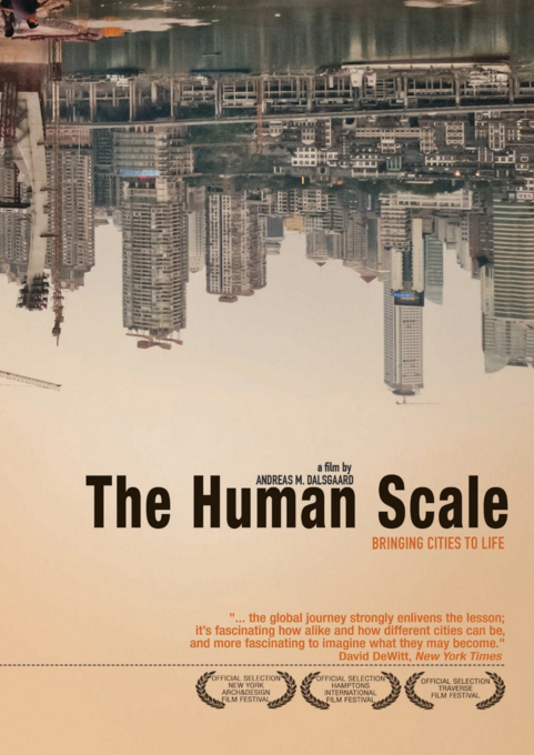
Join Us Next Thursday for a Film Screening
New Yorkers for a Human-Scale City and Tribeca Trust will be hosting a networking event for members of the Alliance for a Human-Scale City (and others who are interested). We will also screen the short film, “The Human-Scale” about the work of architect and planner Jan Gehls. $10 suggested admission. Cash only. The venue sells drinks and snacks at the bar.
Where and When:
Thursday, May 26th, from
6PM to 9PM at The Commons, located at 388 Atlantic Ave.
between Hoyt and Bond Streets in Brooklyn.
Networking begins at 6, Film Screening at 7:o0, Discussion afterwards at 8:00.
Admission is $10 (plus an eventbrite service fee).
We only have 100 seats so get your seats in advance at this Eventbrite link here.
Here is a link to the trailer of the film: https://youtu.be/BxywJRJVzJs
“There Goes the Neighborhood”
Image courtesy of WNYC.org
If you are looking for an in-depth commentary on gentrification and development in our local communities, then the weekly podcasts from WNYC can be your answer. With new episodes released every Wednesday, this topical program goes into Brooklyn and finds poignant examples of development and displacement. With enough followers perhaps they will expand the scope of their research to other boroughs.
To listen to the episodes, and/or subscribe to the podcasts, click here.
“Ask the Mayor”
Image courtesy of WNYC.org
Another weekly episodic to take note of is WYNC’s “Ask the Mayor.” Every Friday, you can call in and ask the Mayor a question. Won’t it be great when our calls get answered and we can ask, “Why can’t high density be accomplished in a mid-rise building and not mega towers?” or how about, “What is the optimal density for a livable city?” Get your questions ready and call in!
For more information on the program, click here.
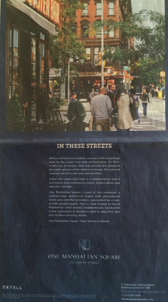
Despicable Real Estate Ad of the Week
In the May 1st edition of the New York Times, Extell placed an ad that markets their new mega towers as a part of a beautiful, human-scale neighborhood. The same neighborhood that the towers will be killing.
Needless to say, we all know what they are really up to…The second photo below is from a rally sponsored by the Coalition to Save Chinatown and the Lower East Side. Look close, the building is called, “the Building from Hell”.
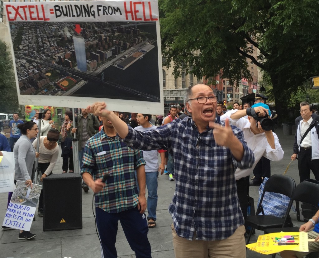
The “building from hell” at a rally at City Hall
Save the Date #2
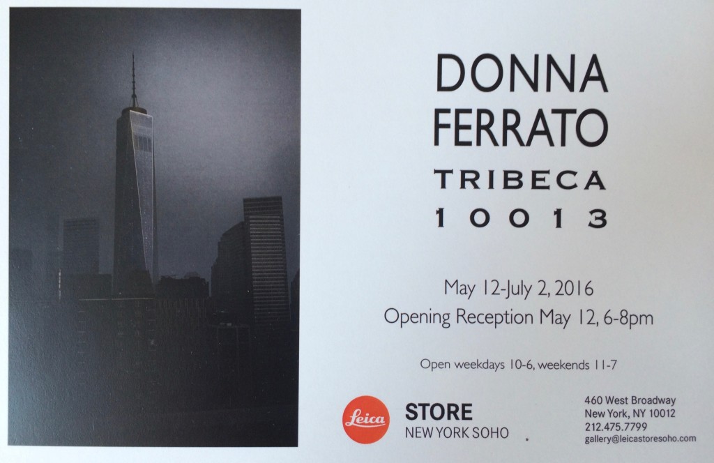
Award winning photographer Donna Ferrato has created a beautiful collection that highlights the transformation of Tribeca through time. Please support her show featured at the Leica Store.
Congratulations!
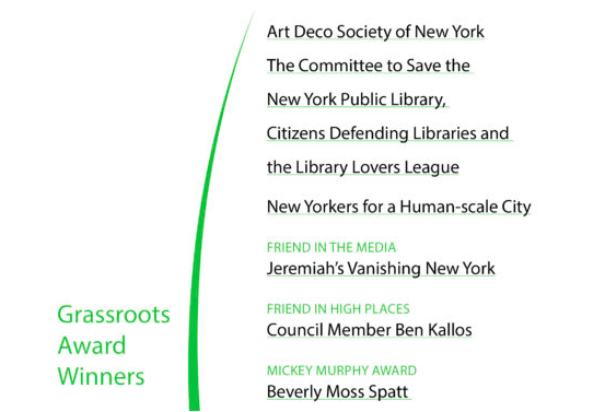
The Historic District’s Council will be hosting its annual preservation party on May 24th. New Yorker’s for a Human-Scale City will be honored at this event with a Grassroots Preservation award. Congratulations are in order for them and the other awardees.
To learn more about the event, or to purchase tickets, click here.
Important Petition and Candlelight Vigil
Image courtesy of Landmark West!
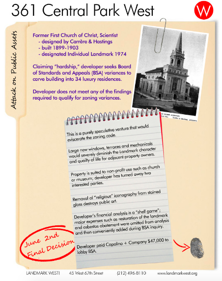
Developers have used undue influence to obtain improper variances to mangle this landmarked building for a planned condo conversion. No harm in turning a church into residences, but do they have to wreck the building in the doing as the plans clearly show? Click here to sign. Candlelight Vigil on Monday May 23rd at 8:00 p.m., corner 96th and Central Park West.
Reminder of the Depth of Hypocrisy in our City’s Political Economy..
Image courtesy of Wall Street Journal
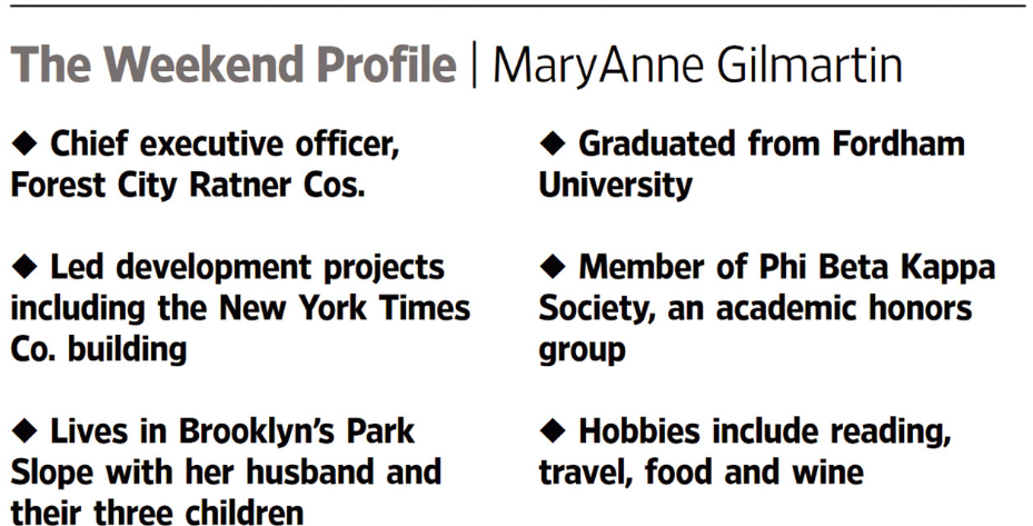
In an article highlighting MaryAnne Gilmartin’s recent real estate achievements, one can’t help but notice that, yet again, we are faced with a developer who lives in a historic district. While the article discusses her new position as CEO of Forest City Ratner Cos. it nonchalantly mentions that she, “Lives in Brooklyn’s Park Slope with her husband and their three children.” And this is when the preservationist in me rages – time after time we see mega-tower developers who flock to the human-scaled historic districts. Even Bruce Ratner, the founder and previous CEO of Forest City Ratner Cos., lives in a historic district. These are just two examples, I’m sure we can all think of others, and there will be more in the future. Hopefully some day, they will realize that everyone wants to live in a human-scaled space.
To read more about Gilmartin, and see the original Wall Street Journal article, click here.
Airports, Made for Everyone but Passengers
Image courtesy of the New York Times
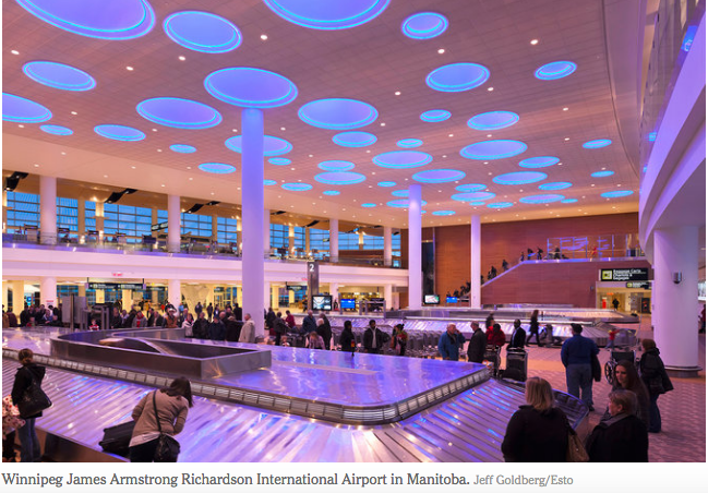
In an extremely eloquent article, NYTimes author, Chris Holbrook describes the trend of ambitiously designed airports that satisfy no one except the architect – and maybe the retailers. He poses the question, “Why are airports built for everyone except the very people who use them the most: the passengers?” Holbrook believes that more attention should be paid to aesthetics, lighting and acoustics. And he’s right. Airports are not conducive to anything but getting out of them as quickly as possible. But that is not always the case with layovers, delays, and cancellations. So why are the patrons not comforted and catered too? Perhaps, someday, architects might think of who they’re designing for and not themselves.
To read the full New York Times article, click here.
A Wrinkle in the Debate over Theodore Roosevelt Park
As the battle to save the Theodore Roosevelt Park wages on, I’d like to take a minute to present a third, as yet unmentioned take on the matter. With sincerest desire to not torture the park advocates – who may have a legitimate case about the seizure of park land – I’d like to present a third point of view. As with every situation, there is always more than one side to a story.
Recently, there has been an on-line discussion between John Massengale*, Jeremy Woodoff** and Lynn Ellsworth*** debating the merits of a return to the original Master Plan of the museum site versus the preservation of the current park space. Ms. Ellsworth defended the notion that park space is public land, a public asset, and said that ad-hoc seizure of it by any institution is problematic. Mr. Massengale and Mr. Woodoff pushed back with an as-yet-untalked about idea, namely, that it would be better to complete the original Master Plan. Hmmm.
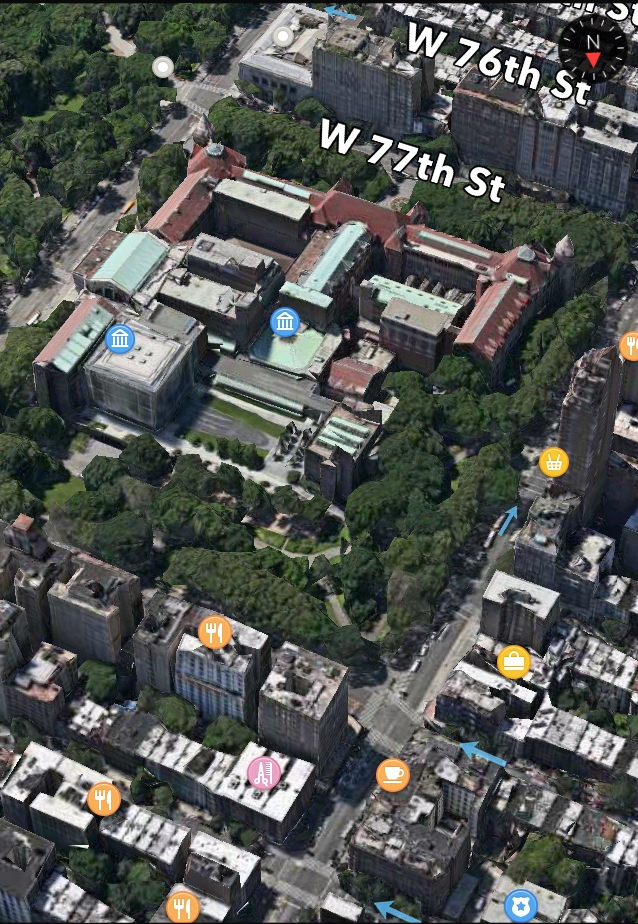
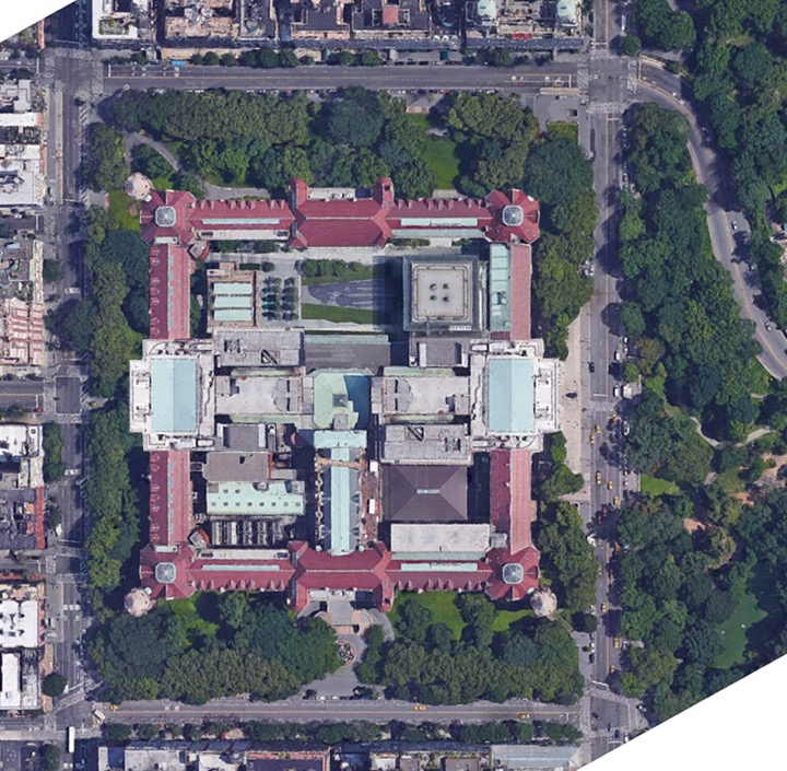
Here is a photo of the existing conditions. You can see that it looks very much “unfinished” with awkward infill in what were originally courtyards.
Remember that the land at Manhattan Square was purchased by the city and management of the property was given over to the Department of Parks in 1869 to build as they saw fit. The city owned the land & buildings, and the museum owned the collections housed within. This represents a deeply intriguing property rights conundrum: much of the eventual outcome may actually hinge on how to interpret those rights.
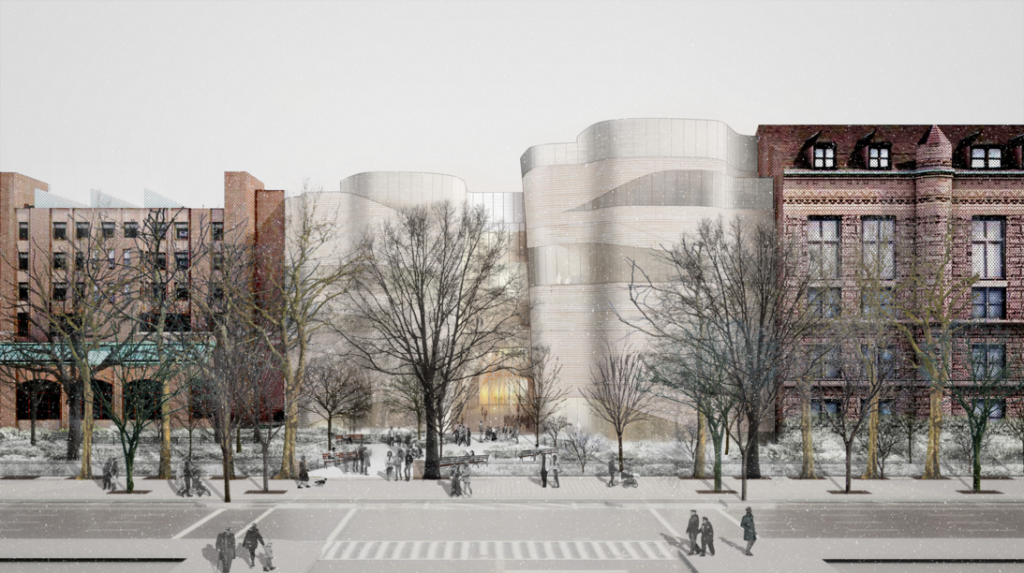
Currently, the museum is trying to expand and occupy the green space in ways that are not even remotely congruent with the original plans of the museum or the current fabric of the neighborhood. Multiple neighborhood groups are making their voices heard in regards to the new development plans at the museum and the potential loss of park space surrounding the existing building. Here is a photo of the proposed expansion.
Click here (and then scroll down) to see an aerial view of what the proposed extension will look like from on high.
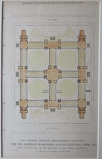
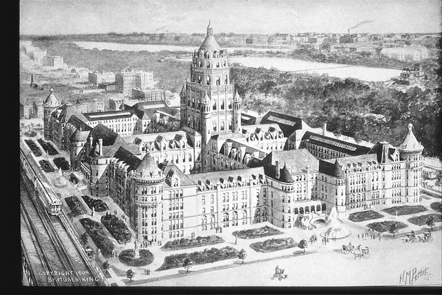
Now let’s look at the twist to this discussion offered by Massengale and Woodoff. They ask, what would it mean to have a completed Master Plan, and what does that look like? Here is Calvert Vaux and Jacob Wrey Mould’s original plan as it appeared in American Architect and Building News, Aug. 12, 1876
And here is John Massengale’s photoshopped aerial rendering of the completed Master Plan in today’s landscape.
Mr. Massengale argues that,
“There’s no question that the four teams of architects who worked on the museum (in order—Calvert Vaux and Jacob Wrey Mould, Cady, Berg & See, Trowbridge & Livingston, and John Russell Pope—all good architects) would want the building completed as a solid rectangular mass, with the northern and western sides making continuous street-walls similar to the southern and eastern sides. That is what each showed in their respective master plans, and that follows traditional principles of architecture and urban design that have been increasingly ignored by the museum in the work it has done on the building since World War II. Looking at the complex from Columbus Avenue now, it resembles a person with their pants pulled down, exposing their backside.[see first photo in this article]”
and in a follow-up email Mr. Massengale added:
“For those who don’t know me, I am literally a tree-hugger—I have been known to go into Central Park and Riverside Park and hug trees. I have a particular love for American Sycamore and London Plane trees, some of which sit within the footprint of the building now proposed by the museum (although the plan is actually warped to save a tree or two). But I support the vision of the museum developed by Vaux, Mould, Cady, Trowbridge, and Pope, which would require the removal of trees that fit within the planned footprint of the building. I realize some in the neighborhood oppose any decrease in the amount of green space now on the block. But I think that idea ignores the principles of successful placemaking and good urban design that Vaux, Mould, Cady, Trowbridge, and Pope envisioned. Pope’s plan came more the 50 years after the original sketches, but like all the architects who came before him, he agreed on the vision that we see on the eastern and southern sides of the building. A vision they wanted continued on the northern and western sides.”
“Since World War II, the museum has followed a more ad hoc vision for the very large and still incomplete building. The currently proposed addition, designed by Jeanne Gang, actually zigs and zags to to save one or two trees. We can argue about the appropriateness and beauty of the proposed architecture, but we can also say that it is one more post-war addition that makes little attempt to unify the ongoing construction of the museum and its place in the neighborhood. in current architectural parlance, it is an Iconic Object, that intentionally separates itself from the image of the museum at the same time that it simultaneously reinforces and breaks down the facade on Columbus Avenue. Unlike Pope’s grand entrance on Central Park West, a Classical element added to the Medieval mass of the museum, Gang’s design is more about the expression of Gang’s challenging aesthetic than the creation of a coherent whole. In the end, it contributes as much to the incomplete backside of the museum as it adds.”
“Pope successfully unified the Central Park West facade while adding a new Classical element. Gang could similarly add a Modern element that would point the way to more unified future development of the museum. Zigging and zagging to save a tree or two leads away from that, though, and so does the idea that completing the greatest museum of natural history in a unified and beautiful way can not add as much to the life of New York as a little less green space around the museum.”
“’Green space’ is not the same thing as a park. Despite the beautiful trees between the museum and Columbus Avenue, the space there is neither a good park nor a good public space. The way that land slopes down from the avenue to the incomplete buildings is not good placemaking—which is why the space is not well used. I live on the Upper West Side, and I have noticed over the years that I have unconsciously avoided walking alongside the museum on Columbus Avenue, despite the beautiful Sycamores, and even though I like Columbus north and south of the museum. And on recent visits I have observed that the space does not attract many users, even for just sitting under the trees.”
“We are increasingly learning from neuroscience and books like The Happy City that there are places where people feel good that attract them, and places with weak or bad urban design that people avoid. Saying that we should preserve every tree in a place like that no matter what is a classic example of not seeing the forest for the trees. Making a better building and park there would also make the experience of Columbus Avenue better, even at the expense of losing some beautiful mature trees. That was the idea 100 years ago, and it’s still the best idea today.”
“The original master plan was followed faithfully for over 60 years; stylistic and other “superficial” changes notwithstanding. I think this is important because it speaks to the historic and practical significance of the original plan, which served the museum so well over such a long period. The question now is, with the ad-hoc additions that have been made in the years since, does this plan still have relevance?”
- The AMNH’s desire to make highly intrusive additions that don’t follow the original master plan, seemingly designed to turn the place into more of a Disneyland than it already has become
- The view of residents who don’t want seizure of public park land for AMNH
- The argument of adherents of the original master plan of the building that a more classical build-out is called for.
“As you state at the end, the issue is complex. While preservation of open space is certainly part of it, so are questions of architecture (how to finish this poor building with its exposed backside) and urban design (how the building should relate visually and programmatically to the neighborhood in which it sits). The old master plan, which served four sets of architects for such a long period, should not, in my view, be relegated to a historical artifact, but should be looked to for guidance and inspiration, even if it no longer can serve as an actual blueprint.”

