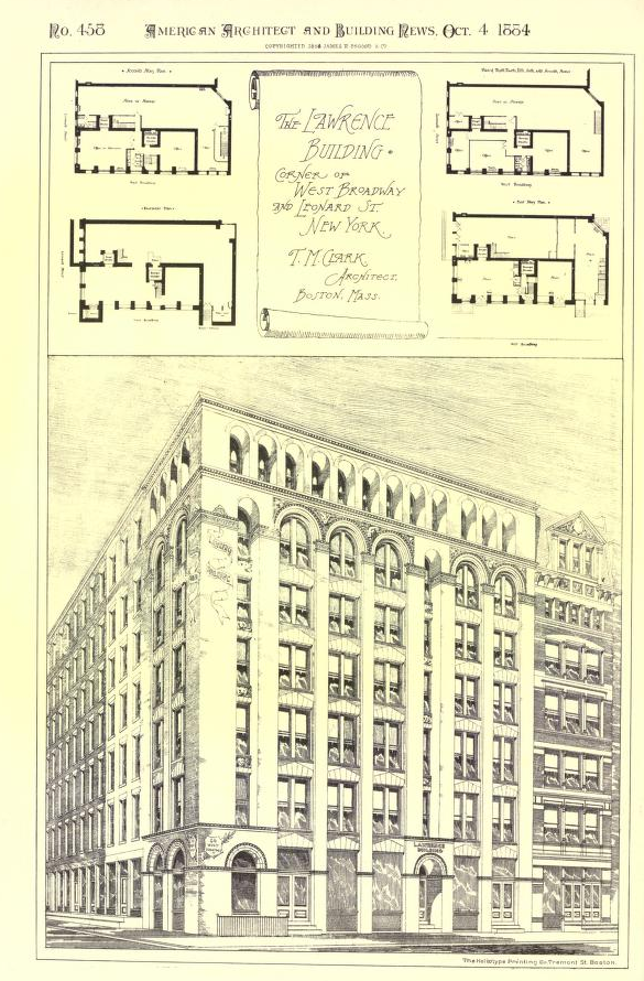
Behold the beautiful Lawrence Building which once stood where Square Diner now sits.
Magnificent, is it not? It was written up in “The American Architect and Building News” of Oct 4, 1884 on page 162.
The review gushed over the “light-buff brick from Perth Amboy,” “the cornices, string-courses and spandrils” and the “window dressings of terra-cotta, make of the same clay as the bricks.” It was designed by T. M. Clark, a well established member of the early American Institute of Architects, several of whose buildings are individual landmarks elsewhere in New York. Note as well the beautiful building next to it the right, now demolished. Yikes, we paid heavy for the short life of the elevated, did we not? Just to the left, you can see what is still standing as the last spice warehouse of New York.
The building was constructed for the Lawrence Warehouse company and was known as the Lawrence Building until its demolition. I suspect it was demolished to accommodate the elevated train – or maybe for the subway construction. West Broadway saw a lot of destruction at that time as they widened the street for those projects. What a loss! But I think this is an excellent candidate for Nathan Silver’s new version of Lost New York which will be coming out soon.
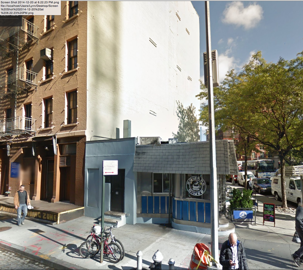
Here is a photo of what the site looks like today. Although I am a fan and a frequent patron of Square Diner, we lost a lot. Not Square Diner’s fault of course, and please patronize them.
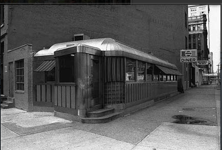
And here, from Forgotten New York, is what Square Diner used to look like circa 1972 before they changed the roof.
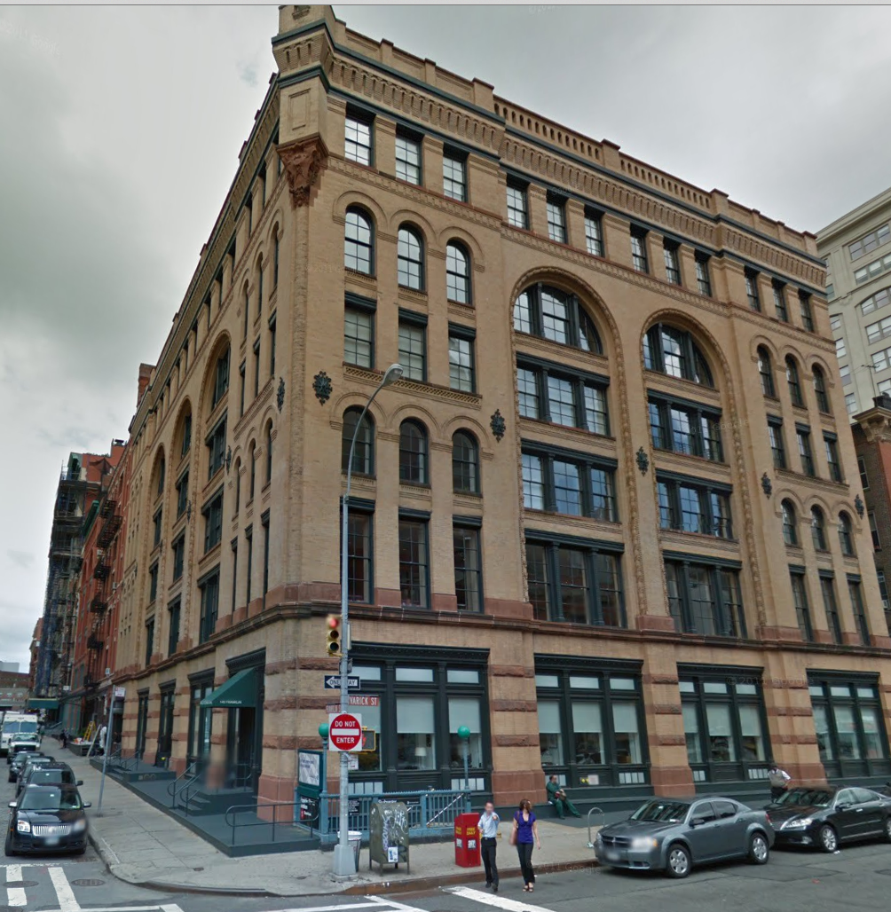
What I find fascinating are the parallels between the demolished Lawrence Building and another lovely buiding in Tribeca West Historic District at the same corner, just a block north at Franklin and Varick. Do you also see the similarities? Not the same architect.
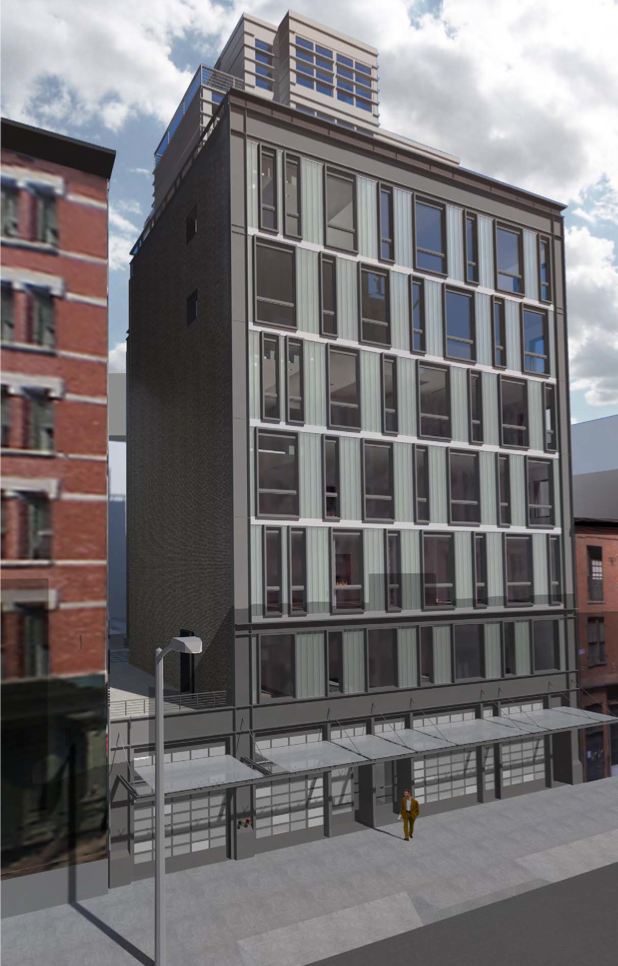
And now look at what we get in 2014, just a few doors down from the great demolished Lawrence Building.
I cannot help it. This is just so much lesser a building, it doesn’t even to seem to merit the word ‘architecture.’
Frankly, it looks like a gray cellular mess that only Darth Vader could love, a Miesian curtain wall trope forced into a post-modern fenestration pattern in what only a fan of Orwellian lies would call “contextual” in-fill without blushing in shame.

