 Two photos
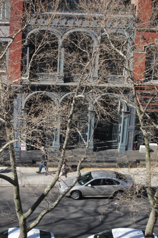
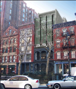
The existing building at 172 Duane has a reconstructed cast iron facade, showcased as a ruin, behind which is a small, totally modern glass building, whose principal virtue is that is small and almost invisible behind the reconstructed cast iron facade.
The small modernist building we can barely see behind the cast iron predates the designation of Tribeca West Historic District. This use of the cast iron has always divided preservationists. Some, such as Francoise Bollack (author of Old Buildings New Forms) like the current building because it is in a “constructive dialogue with the past”. Others, like the architect, author, and former preservation commissioner who walked Tribeca with me last year find present-day 172 Duane to be an appalling insertion (glass blocks, really?) that drags down the aesthetic of the entire block and indulges in a strange kind of “facadism” (see the next blog posting on that contentious issue).
Some agreement
On the other hand, everyone agrees that the present building is at least small and discrete and lets the surrounding historic district stand out as the belle of the ball. It is after all one of the great blocks of New York and widely celebrated by such luminaries as Paul Goldberger, the architecture critic (see his tribute to Duane Street on page 24 of his book, “The City Observed”.
New Building or Rooftop Addition?
So far in this story everyone is happy. But then in 2006 the owners of the building asked LPC for permission to build an excessively large, historically unprecedented 4-story glass “rooftop addition”. It is shown in the top photo above. What is very clear is that this is not a rooftop addition, but a new building altogether. The proposed design is – by intent – as anti-contextual as possible. It meant to celebrate the architect and the design philosophy of modernism, not Tribeca’s historic district. Look at the photo above and make your own conclusion.
In 2008, the community board, to its credit, gave a firm no to this proposal in a resolution dated May 27th, 2008. Then, in a controversial hearing in which the Historic Districts Council testified and called the glass house design “unacceptable”, Landmarks Preservation Commission gave a permit anyway. It was granted pending certain revisions that were supposed to follow the comments of the commissioners. An example of the comments can be found in the archives of the Downtown Express. The Chair was quoted as saying: “I think this building needs to be rethought in terms of bulk.” Another commissioner said that “It certainly overwhelms the original building.” Here is a photo of the original building. 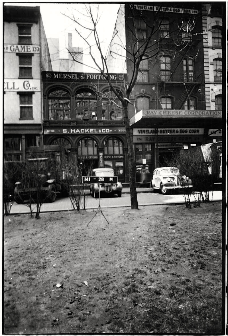
What criteria?
An important angle to this story is that the scale of the design is out of whack with the LPC’s own internal guidelines for rooftop additions. How could they have granted a contingent approval in the first place? Page 4 of their “Guidelines for Rear Yard and Rooftop Additions” has a section called “Design Considerations”. Four questions are asked:
1. Does the addition preserve a sense of the original volume of the building? (from the photos we have, clearly the answer is no)
2. Does the scale of the addition overwhelm the building? (obviously, yes, as that was the sense of the commentary at the public hearing by the commissioners themselves).
3. How visible is the addition from the public thoroughfare? (from the architects renderings, this is “look at me” new building, that makes no attempt whatsoever to be discrete. See this link for another image: https://www.flickr.com/photos/65998648@N02/6038378766/in/photostream/
4. Does it comply with the New York City Zoning Resolution? There is an important unknown here: what is the floor area ration exactly and on what is it based, the original federal house or the two-story building that followed it?
Some relevant history
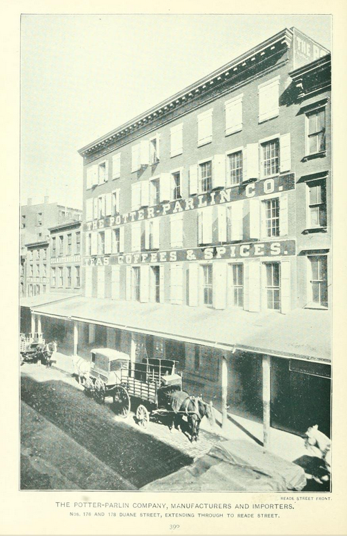
The building on this site was always small. Prior to 1900 there was a very small four-story building (see photo below) it was the first cornice from the left. It looks to have been a federal era house converted to commercial use.
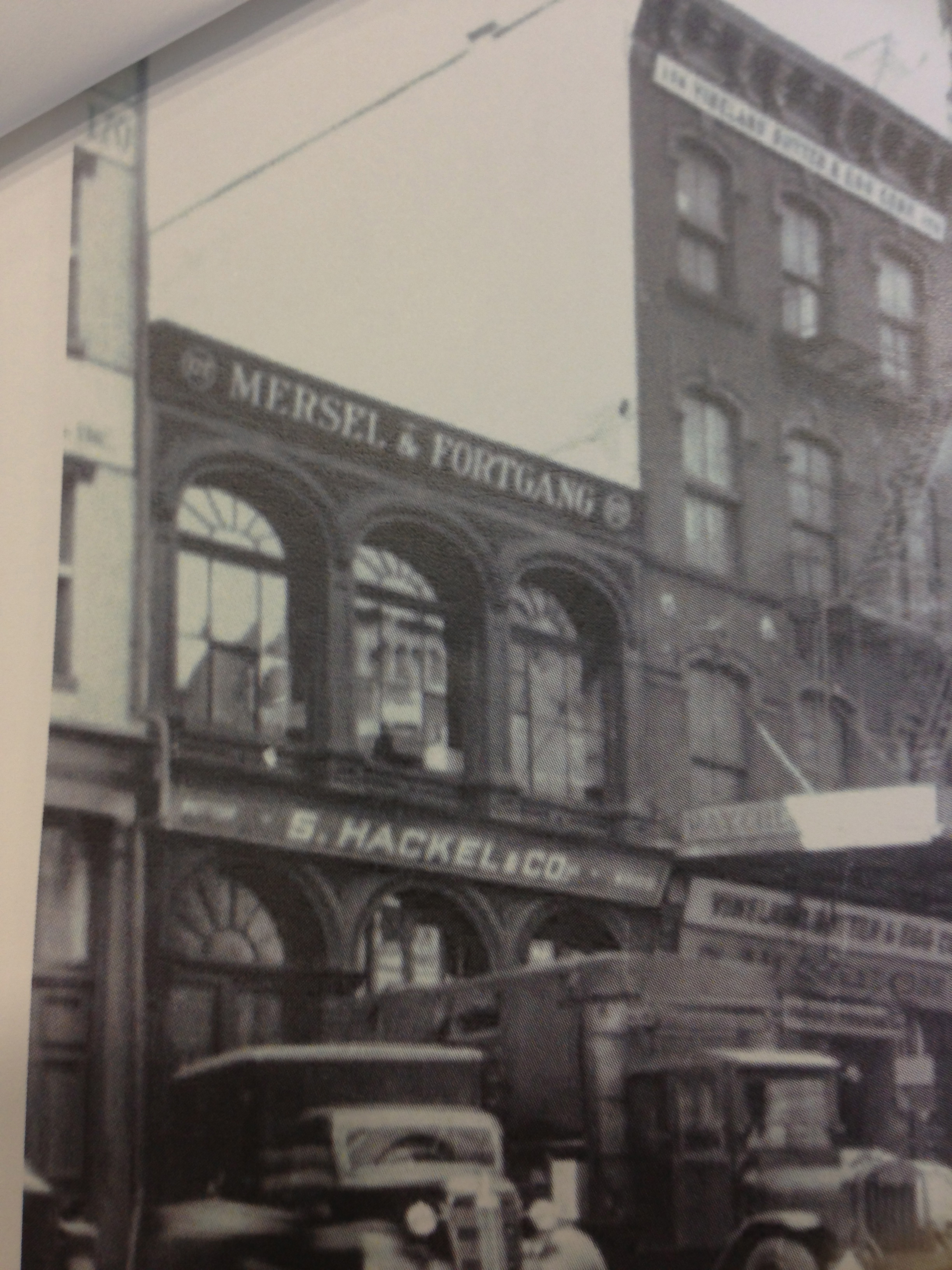
Although technically it was 4-stories, it was a very small four stories, clearly not as tall as the other four story buildings near it. Something happened to the building (a fire perhaps?) and it was replaced with a fine cast iron two-story building of great charm. It became an egg and butter warehouse. Here is another photo of it, a bit murky, but it’s charm comes through. Why was restoration never considered? Opinions welcome. Should this come back to the Community Board? Should there be another hearing? What exactly is the underlying zoning? What’s wrong with recycling the existing architectural language of Tribeca when it comes to in-fill inside the historic district?

